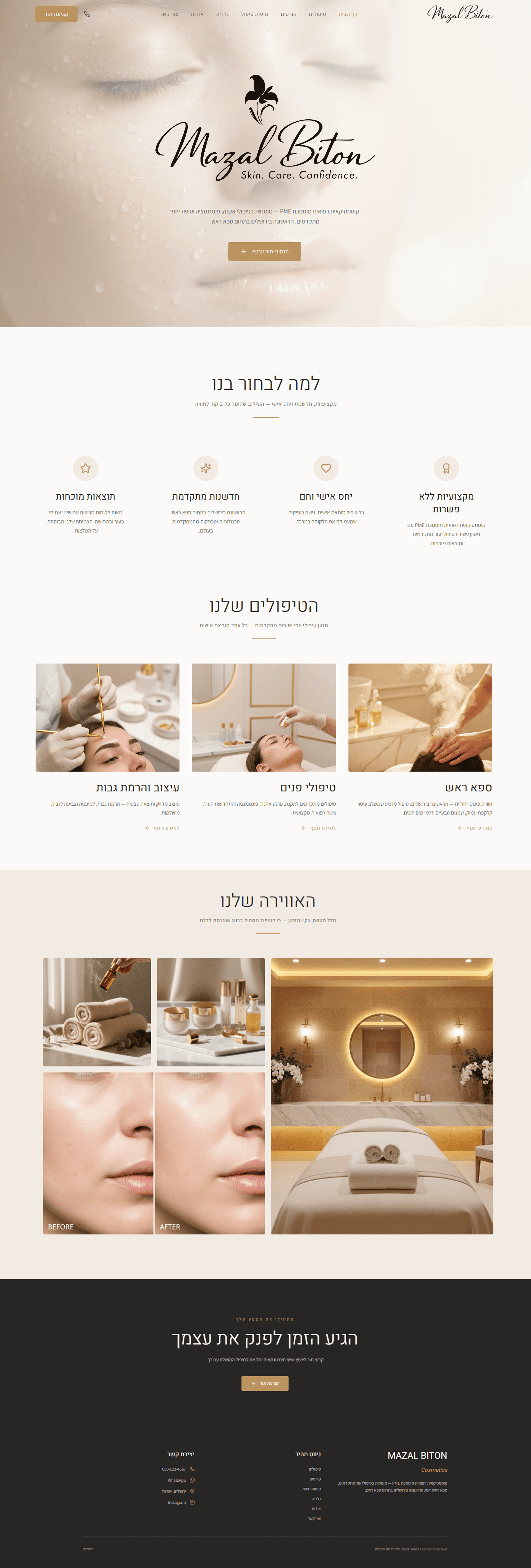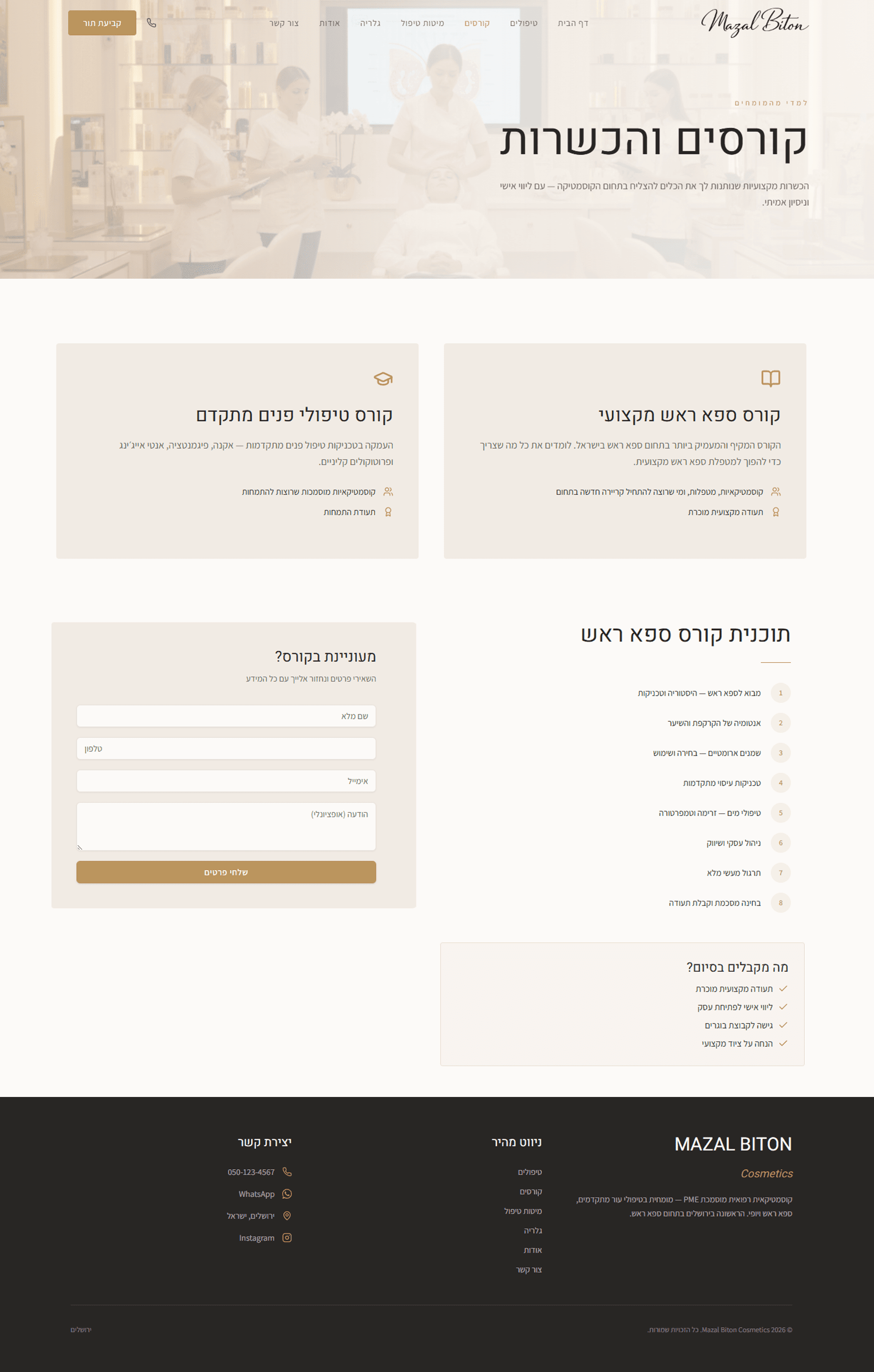
Branding and website design for a medical cosmetics business, focused on user experience, premium feel, and clean, precise aesthetics
Color Palette
A warm earthy color palette that conveys calmness, luxury, and clean professional care
Sitemap Structure
A clear overview of the website’s hierarchy, user journeys, and content architecture.

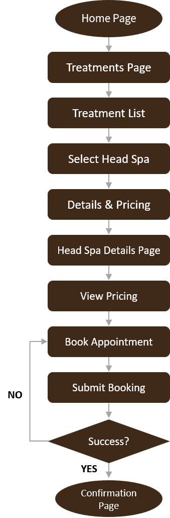
User Flow
User Flow Design for Two Core Processes: Treatment Booking and Course Registration